
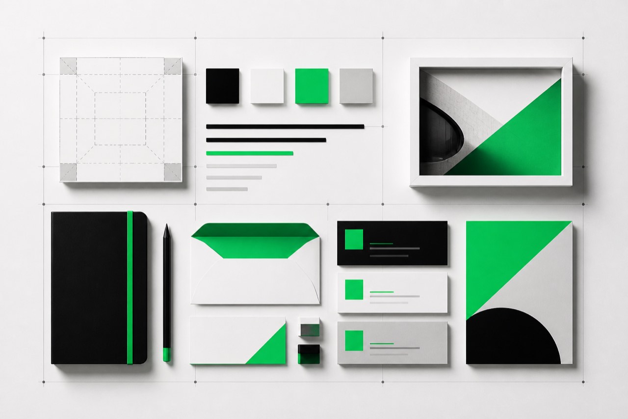
Growing teams need shared decisions, not shared taste
When one founder approves every design, brand consistency may live in that person’s head. Growth changes that. A website developer, salesperson, deck designer, print vendor and new employee may all make brand decisions at the same time. Without a shared reference, each fills the gaps differently.
Guidelines reduce that ambiguity. They do not make the brand valuable by themselves. They make approved choices repeatable, which helps each customer touchpoint feel related to the same business.
Useful brand guidelines cover more than a logo file
Logo usage
Include the approved versions, minimum size, clear space, background rules and examples of misuse. This prevents stretching, recolouring, crowding and placing the mark where it becomes unreadable.
Colour system
Record exact values for digital and print use, plus accessible combinations. A colour palette should explain roles, not just display swatches. State which colour carries emphasis, which supports text and which backgrounds are approved.
Typography
Define typefaces, weights, hierarchy and practical fallbacks. Show how headings, body copy, labels and numbers differ. This helps a pitch deck and website feel connected even when their layouts are not identical.
Imagery and graphics
Describe the photographic mood, illustration style, icon rules and treatments to avoid. “Use premium images” is too vague. A useful rule might specify natural workplace photography, restrained contrast and no staged handshake pictures.
Tone of voice and messaging
Voice rules guide what the business sounds like. Include audience, personality, sentence style, preferred terms, prohibited phrases and examples. Messaging should capture the central promise, supporting points and evidence, so teams do not rewrite the strategy for every brochure.
Logo, visual identity, guidelines, Brand Bible and brand story are different
| Term | What it means |
|---|---|
| Logo | A recognisable mark or wordmark. It is one asset, not the whole brand. |
| Visual identity | The connected visual system: logo, colour, typography, imagery, graphics and layout behaviour. |
| Brand guidelines | Instructions for applying approved visual and verbal choices consistently. |
| Brand Bible | A deeper internal reference that may add positioning, audience, personality, principles and detailed rules. |
| Brand story | The narrative that explains the business’s purpose, context, point of view and promise. |
The labels vary between studios, so confirm deliverables rather than buying a name. Headstart separates Logo Design from Brand Bible and Brand Story, allowing a business to choose the depth it needs.
How detailed should brand guidelines be?
The right depth depends on how many people create customer-facing material and how varied those materials are. A founder-led local business may need a concise guide covering logo, colour, typography and a few examples. A growing team working with agencies, printers, salespeople and regional partners needs more rules, templates and governance.
| Business situation | Useful level of guidance |
|---|---|
| New business establishing its first identity | Core logo files, colour values, typography hierarchy, basic imagery direction and essential do/don’t examples. |
| Small team producing websites, posts and proposals | Core visual rules plus reusable layouts, voice principles, message hierarchy and channel examples. |
| Growing organisation with several vendors | Detailed component rules, accessible combinations, asset ownership, approval workflow, templates and version control. |
| Business preparing a repositioning | Audience, positioning, architecture and messaging decisions before visual execution rules are finalised. |
Page count is a poor measure of quality. A long PDF full of mood-board imagery may answer fewer production questions than a concise, searchable guide with downloadable assets and clear examples. Ask what decisions the document will help other people make without waiting for the founder.
Accessibility should be built into the system
Brand colours are not automatically suitable for every text and background combination. Record approved accessible pairings, focus styles and minimum text sizes for digital use. The W3C’s WCAG guidance on minimum text contrast explains the ratios used for common text. Alternative brand combinations should be provided when a favourite pairing does not meet the intended use.
Trademark guidance and brand guidelines serve different purposes
Brand guidelines explain consistent presentation. Trademark registration and enforcement concern legal protection in particular jurisdictions and classes. A design guide cannot establish that a name or logo is legally available. Search relevant registries and obtain qualified legal advice before relying on a mark. The World Intellectual Property Organization’s trademark overview is a useful introduction, not a substitute for jurisdiction-specific advice.
Consistency does not mean making every asset identical
A website needs navigation and interaction. A proposal needs clarity and detail. A pitch deck needs a persuasive sequence. Strong guidelines define recognisable ingredients while allowing the format to do its job. This is why pitch deck design should follow the identity without copying the website page for page.
Headstart’s point of view is simple: write enough rules to protect recognition and speed decisions, but leave room for purposeful creativity. A ten-page document that nobody can apply is less useful than a shorter system with clear examples and accessible assets.
Keep the guidelines usable after launch
A guide becomes stale when files are scattered, ownership is unclear or new patterns never get documented. Assign one owner, publish a dated source of truth and keep approved logo, font, template and image assets beside it. Changes should explain what was revised and where the new rule applies.
- Test real tasks. Ask a new designer or salesperson to create one common asset using only the guide.
- Record recurring questions. If three people ask how a logo works on photography, the guide needs an example.
- Add patterns, not exceptions. Document reusable solutions instead of approving one-off workarounds indefinitely.
- Review access and licences. Confirm that teams can legally and practically use the specified fonts, photographs and templates.
- Schedule reviews around change. Revisit the guide after a repositioning, new product family, website rebuild or major channel expansion.
The result should function as an operating tool. It should help a vendor move faster while making fewer subjective guesses, and help the business evaluate work against agreed rules rather than personal taste.
What to prepare before commissioning guidelines
- Your offer and primary audiences.
- The business name and any existing logo files.
- Examples you like, with reasons rather than “make it like this”.
- Current website, decks, proposals and stationery.
- Common production needs and the people who create them.
- Words or claims the business must use consistently.
- Accessibility, language and print requirements.
Also identify who approves work, where master assets will live, which languages and formats are required, and whether existing marks or fonts have documented rights. If the brand currently changes from asset to asset, start by deciding whether the logo itself needs work or whether the missing layer is a usage and messaging system. You can compare Logo Design, Brand Bible and Brand Story inside the quote builder.